final EVALUATION
The theme I chose was Diary. There were got two different type of Diary, one of them I chose is Same old. same old and the another one is A time to be remember. The reason I chose Same old it because it has inspired me and I love the way people express themselves about everyday life, feeling and social. Also it got me lot of idea to create my version. My first ideas is trying to took a picture of a variety people on the outsides. Therefore, whoever I tools a picture of a person, that person need to write a short diary about how they feeling, or what you thinking right now? It important to me that i don't have to make up their thought, which is good idea to express their thought and it main thing in my themes "Diary".
I have been research about 4 different artist, which is linked this theme. Some other wrist I didn't like for example Jimmy Owenns because it have a lots of book with some fews words and boring picture, i didn't like his style of photography, because it not enough idea for me and it kind of pale to me that I can't tell what it this. However Bill Brandt is given me a lot of idea to lead something i want to do for example, he have took a picture that thing goes a natural thing happened as my ideas I wanted ask people put their thought what they thinking right now and write their handwriting and no matter if it not peferct because it has be natural. After I have research, I took a photograph on outside, however I decide to change as atmosphere because of that it didn't work my plan, so I have decide to use a room with back drop with black colour and it does helped my ideas. The colour of Bill Brandt took is black and white so that mean I will make sure that only allowed of word is white and back drop is black, so it showed that I liked some of his ideas help.
The experiment is not much because I use Canon photograph and using the Photoshop to edit the picture and diary. Most of the time I use the black back drop to create my ideas
My first final pieces
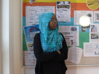
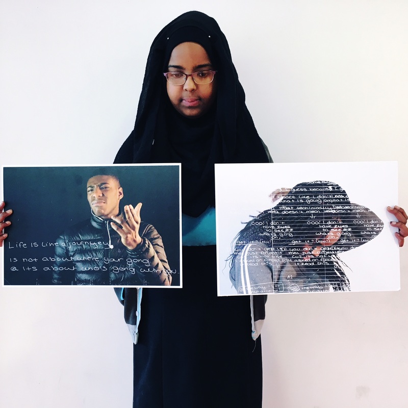
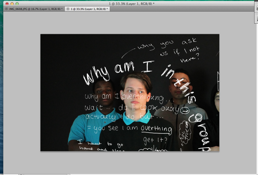
This picture is my first time i did in photoshop, however it easy to do overlap and my respond to this, it not enough to impact and i bit dislike because I don't like the way background colour and it seem distract and I cannot read properly what the write try to say. So my aim next time is make sure the background is pale and one colour only because there already writing behind a person.
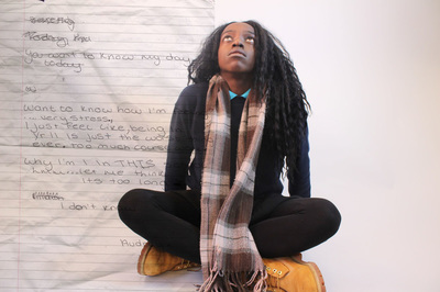
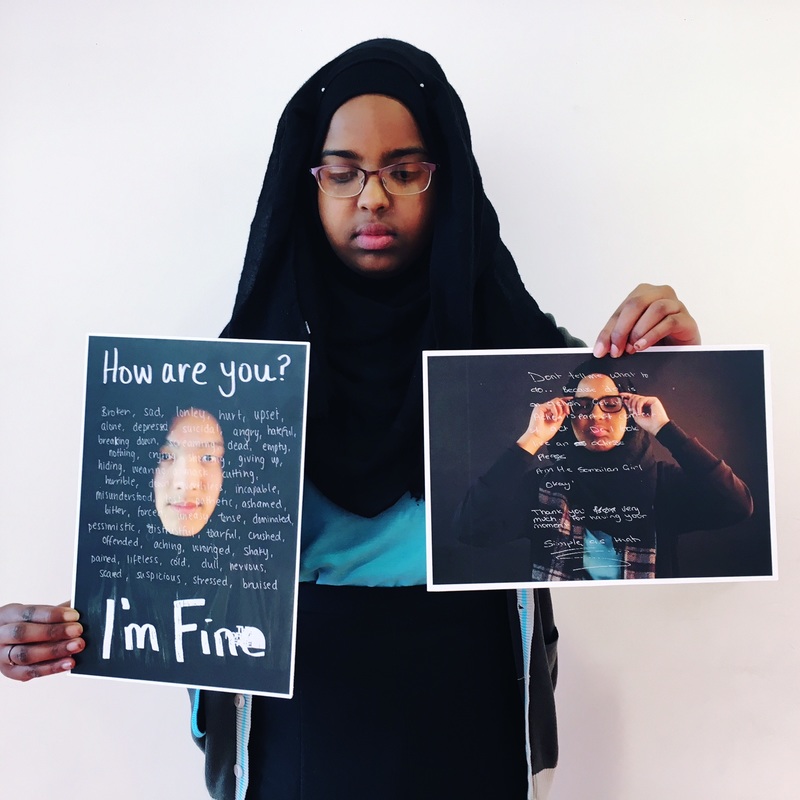
There another one I has been success to pass my last aim I need to change and I finally like it because it more personal and I not make her do something but a let her to do something happen to her right now and I prefer that way because it not itself planned or expect but it turned out it well ands you also can see the paper of the original. My next aims is make sure that i have more photo to develop with word and I might change the colour back drop make more impact and tempted from audience.
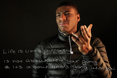
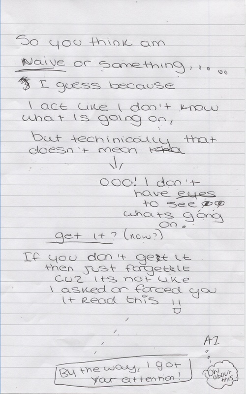
This is my favourites photo and is has lot of achieve what I wanted and it does develop the word in photoshop. I did Invert it when it already on this person and change the colour to black and white, also it I change the level of the word so you can able to see clearly and bold. Finally am aim to change from normal image to Screen, it mean that the diary image and this person image has allowed goes through together so it look like it invisible page with a word on the a person image.
My aim is try to a big groups with an A3 paper as diary to allowed them to write to express again.
My aim is try to a big groups with an A3 paper as diary to allowed them to write to express again.
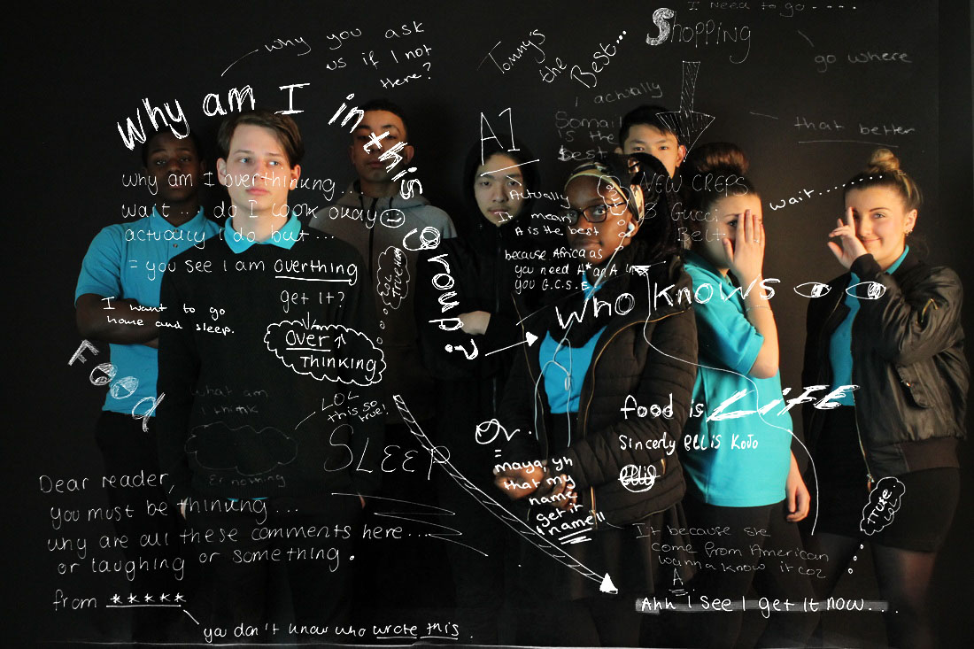
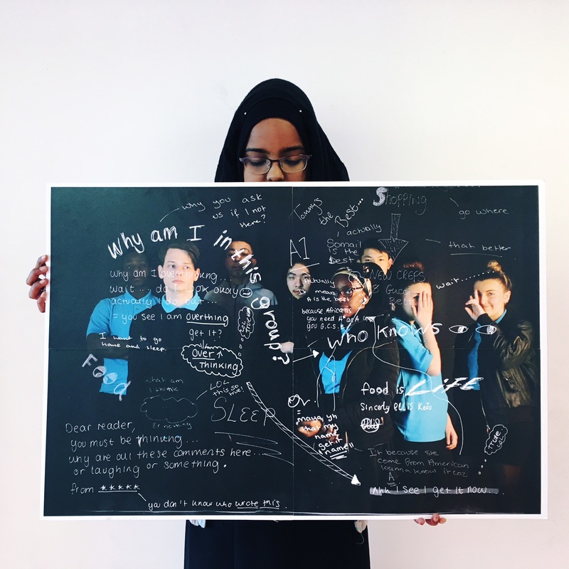
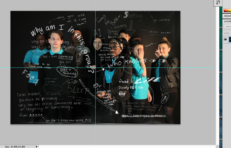
This first groups diary I ever made and I been success a lot that one because I like the way everyone express their thought and there also lot of variety writing to show there more personal there and mostly bold. There are more eye catching to read, it has same method what I did last one. However, I quite disappointed because you cannot see some of the word has missing, it because I try to balance of the level and I did, it not easy to change and something it come up with some white mark that shouldn't happened there.
My last next aim is try use white back drop.
My last next aim is try use white back drop.
Other Experiment
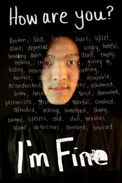
This my final make as project and I decide to make white to background to make big impact and also I add repition to look like she write all over the picture, but I did 3 copied of these diary in 3 column to make look like that person have stressful a moment, however it does not back up my ideas because we need to read what they try say.
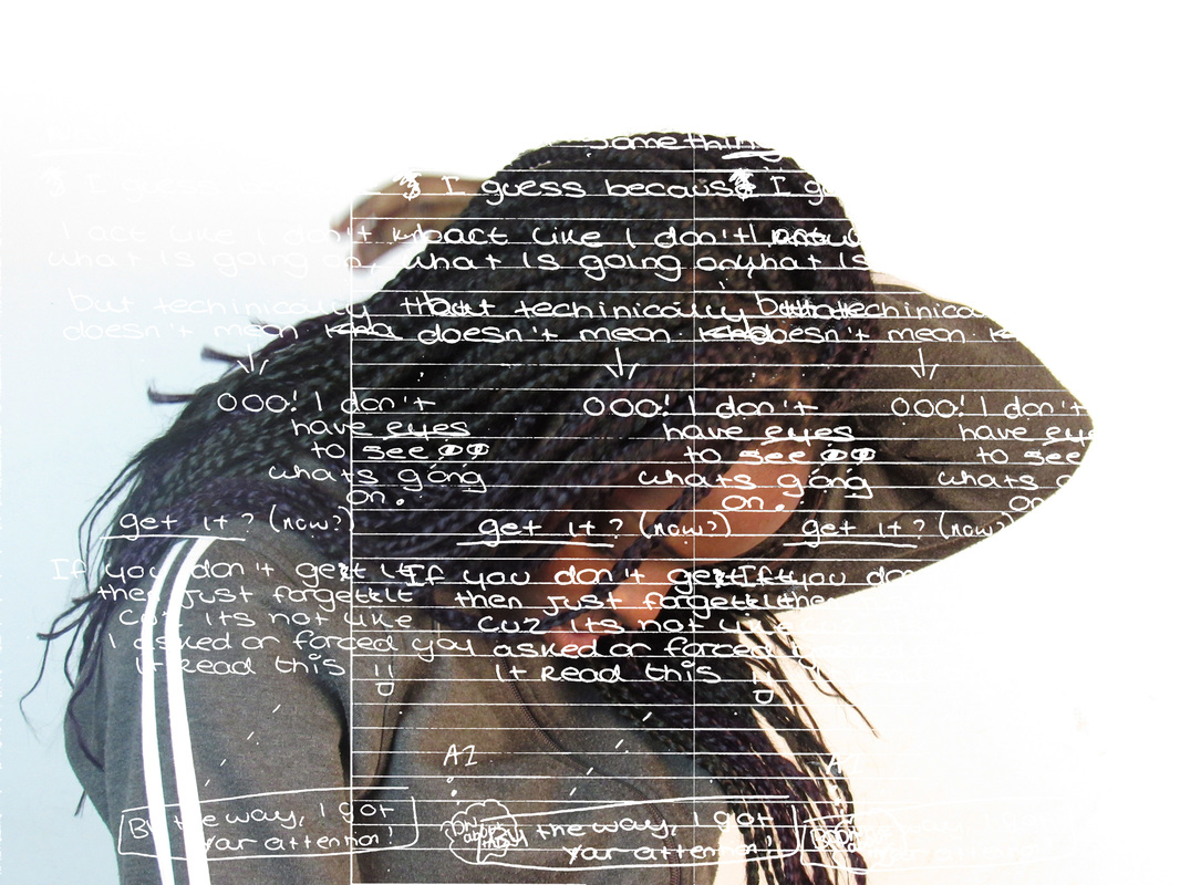
How to make and edit a2 paper?
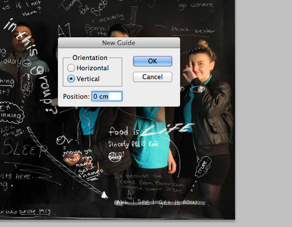
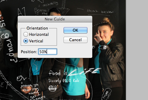
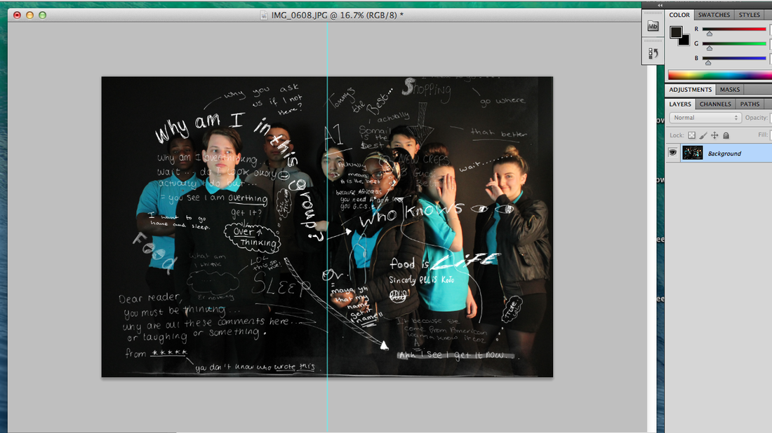
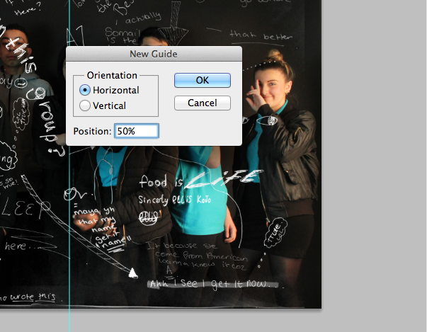
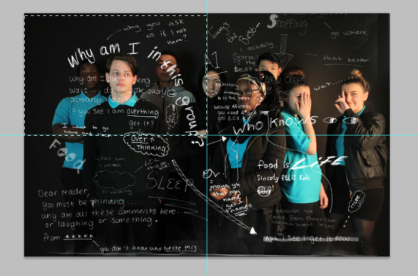
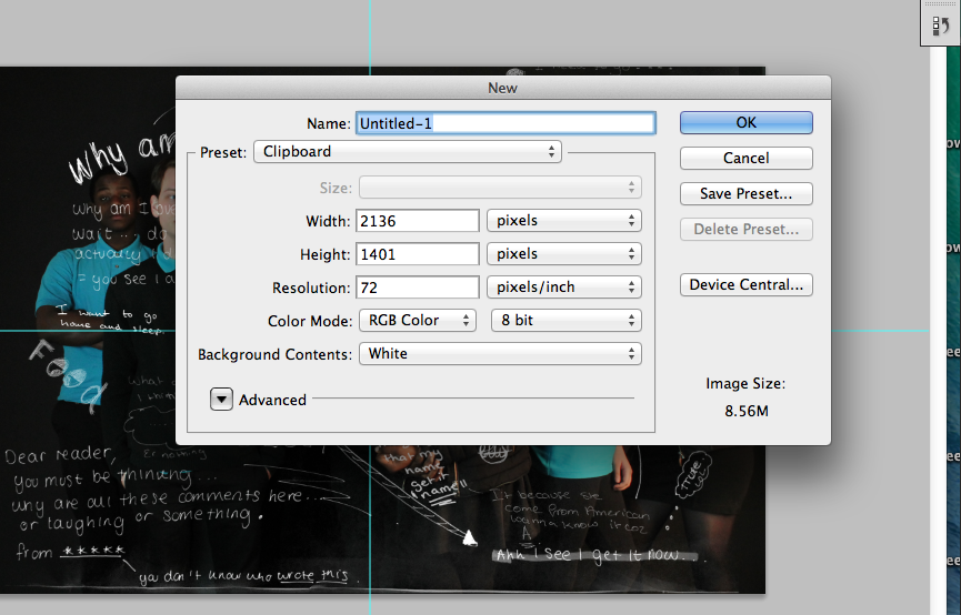
The first thing I do is having the original picture, I goes to the toolbar to click the View then I stroll down to New Guide, then I need to crop in half, which is 50% and other is horizontal is same thing is 50%, then I focus the one part and do Command C and Command V as copy and paste and then Command N to going to the name of the one small picture then it goes to new page. Then Command V for the paste. So I can print is in A3 from each 4 picture to make look like A2. However I thought I can print it from A2 straight aways.
After
After
Final though of progress
I am really pleased with the outcomes of all of these pieces. I think that they show openings in a way that is different and eye catching. Since the start of unit 2, I have learned a lot and developed my skills in this theme and topic. I am happy with the way I have worked this unit as I have worked hard and I think that it has paid off. I look forward to having my pictures displayed near the end of the year.